top of page

INTRODUCTION & CONTEXT
Context
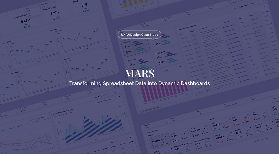
MARS, a leading client of Fractal Analytics, relied heavily on massive Excel spreadsheets containing thousands of rows of critical business data. These static files were difficult to interpret, inefficient to share, and nearly impossible to derive quick insights from.
As a UX/UI Designer at Fractal Analytics, I collaborated with business consultants to digitally transform these spreadsheets into interactive dashboards that convert complex tabular data into infographic-style visualizations with clear hierarchy and brand alignment.
Problem Statement
"How might we transform thousands of rows of static Excel data into intuitive, actionable dashboard interfaces that empower MARS teams to make faster, data-driven decisions?"
Discover
Understanding user needs through research and stakeholder analysis
DOUBLE DIAMOND PROCESS
Primary Research
Stakeholder interviews with MARS teams uncovered essential user needs and requirements:
Time Efficiency
Users needed to reduce time spent finding and analyzing data from hours to minutes.
Visual Clarity
Stakeholders desired intuitive charts and graphs over raw numerical tables.
Data Comparison
Users wanted to compare metrics across time periods, regions, and categories effortlessly.
Report Generation
Teams needed automated reporting capabilities to replace manual Excel exports.
Collaborative Access
Multiple stakeholders required simultaneous access to live, updated data.
Alert Systems
Users wanted proactive notifications when KPIs crossed critical thresholds.
Quick Filtering
The ability to drill down and filter data dynamically was essential for analysis.
Secondary Research
Analysis of MARS's existing data workflows revealed critical pain points in their Excel-based processes:
Data Overload
Users struggled to extract meaningful insights from thousands of Excel rows without clear visual hierarchy.
Inefficient Workflows
Teams spent hours manually filtering and reformatting data to generate simple reports.
Limited Accessibility
Excel files were difficult to share across teams and impossible to access on mobile devices.
Define
Synthesizing research into actionable insights and goals
DOUBLE DIAMOND PROCESS
Stakeholder Personas & Empathy Maps


Ideation & Prioritization
Through collaborative workshops with business consultants and stakeholders, we generated and prioritized dashboard features based on user impact and technical feasibility.
Interactive KPI Cards
Dashboard cards showing key metrics with drill-down capabilities
IMPACT
High
EFFORT
Low
Dynamic Filters
Multi-dimensional filtering system for data exploration
IMPACT
High
EFFORT
Medium
Visual Charts & Graphs
Automated chart generation from tabular data
IMPACT
High
EFFORT
Medium
Export & Share
Export dashboard views as PDF or share links
IMPACT
Medium
EFFORT
Low
Real-Time Data Sync
Live updates as source data changes
IMPACT
High
EFFORT
High
Custom Alerts
Notifications when metrics cross thresholds
IMPACT
Medium
EFFORT
Medium
Prioritization Framework
High Priority
High impact, Low-Medium effort
Medium Priority
Medium impact/effort balance
Low Priority
Lower impact or high effort
Problem Framing
Pain Points
Slow Excel workflows, data overload, limited visualization, version control issues
Opportunities
Real-time insights, interactive visualizations, collaborative access, automated reporting
Proposed Features
KPI cards, dynamic filters, visual charts, export tools, real-time sync
TO-BE Journey Map
Envisioned Experience
Instant Access
ACTIONS
Opens dashboard, sees live data automatically
THOUGHTS
"Everything is already here and up to date!"
Confident → Pleased
IMPROVEMENTS
Real-time data sync, no manual requests
Quick Filtering
ACTIONS
Applies filters with a few clicks, data updates instantly
THOUGHTS
"This is so much faster than Excel"
Satisfied
IMPROVEMENTS
Intuitive UI, instant responsiveness
Visual Insights
ACTIONS
Reviews auto-generated charts and identifies trends
THOUGHTS
"I can actually see the patterns now"
Empowered
IMPROVEMENTS
Automatic visualizations, clear hierarchy
Easy Sharing
ACTIONS
Shares dashboard link with stakeholders
THOUGHTS
"They can explore the data themselves"
Efficient and collaborative
IMPROVEMENTS
Live sharing, interactive exploration
How Might We...
...transform thousands of rows of static Excel data into intuitive, interactive dashboards that enable MARS teams to access insights instantly and make data-driven decisions with confidence?
AS-IS Journey Map
Reporting
ACTIONS
Copy-pastes charts into PowerPoint for presentation
THOUGHTS
"This data is already outdated"
Disappointed
PAIN POINTS
Static snapshots, no interactivity, rapid obsolescence
Analysis
ACTIONS
Creates pivot tables and manual charts
THOUGHTS
"There must be a faster way to do this"
Overwhelmed
PAIN POINTS
Time-consuming manual work, prone to errors
Data Cleaning
ACTIONS
Opens large Excel file, applies filters, removes duplicates
THOUGHTS
"This file is so slow... is it even complete?"
Frustrated
PAIN POINTS
Performance issues, unclear data quality
Data Request
ACTIONS
Emails IT team requesting latest Excel export
THOUGHTS
"I hope this doesn't take too long"
Neutral → Impatient
PAIN POINTS
Delays in receiving data, version control issues
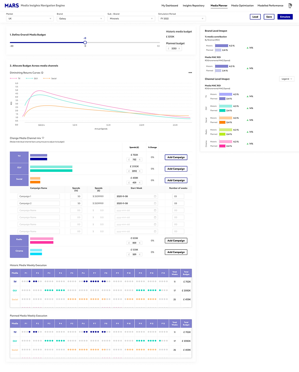
Core Dashboard Components
Visual Charts
Automated generation of bar charts, line graphs, and pie charts from tabular data
Dynamic Filters
Multi-dimensional filtering system for real-time data exploration
KPI Cards
Interactive metric cards with drill-down capabilities and trend indicators
Export Tools
Export dashboard views as PDF, PNG, or share via link
Real-Time Sync
Live data updates ensuring dashboards always reflect current information
Alert System
Customizable notifications when metrics cross defined thresholds
DOUBLE DIAMOND PROCESS
Develop
Deliver
Finalizing dashboard designs through testing and validation
DOUBLE DIAMOND PROCESS
High-Fidelity Dashboard Designs
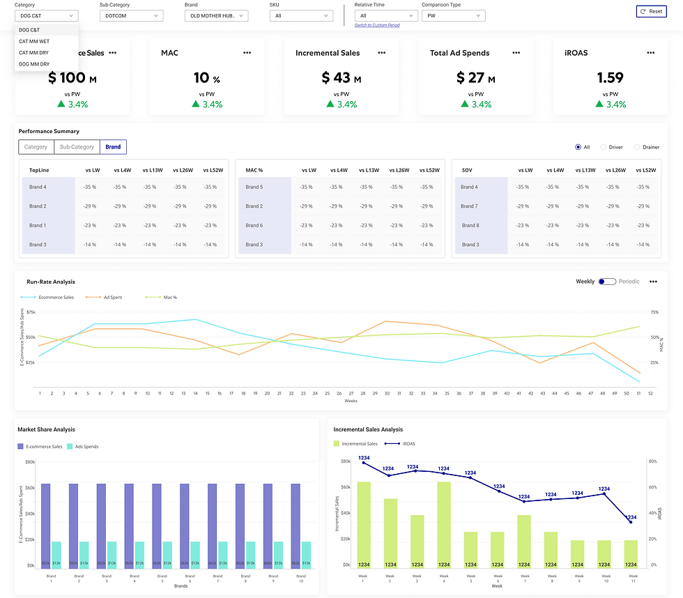
Overview Dashboard
High-level summary showing key metrics, trends, and alerts at a glance for executive stakeholders

High-Fidelity Dashboard Design

Low-Fidelity Wireframe

Original Data View
KPI Cards
Interactive metric cards with drill-down capabilities, trend indicators, and comparison to previous periods
High-Fidelity Dashboard Design

Low-Fidelity Wireframe
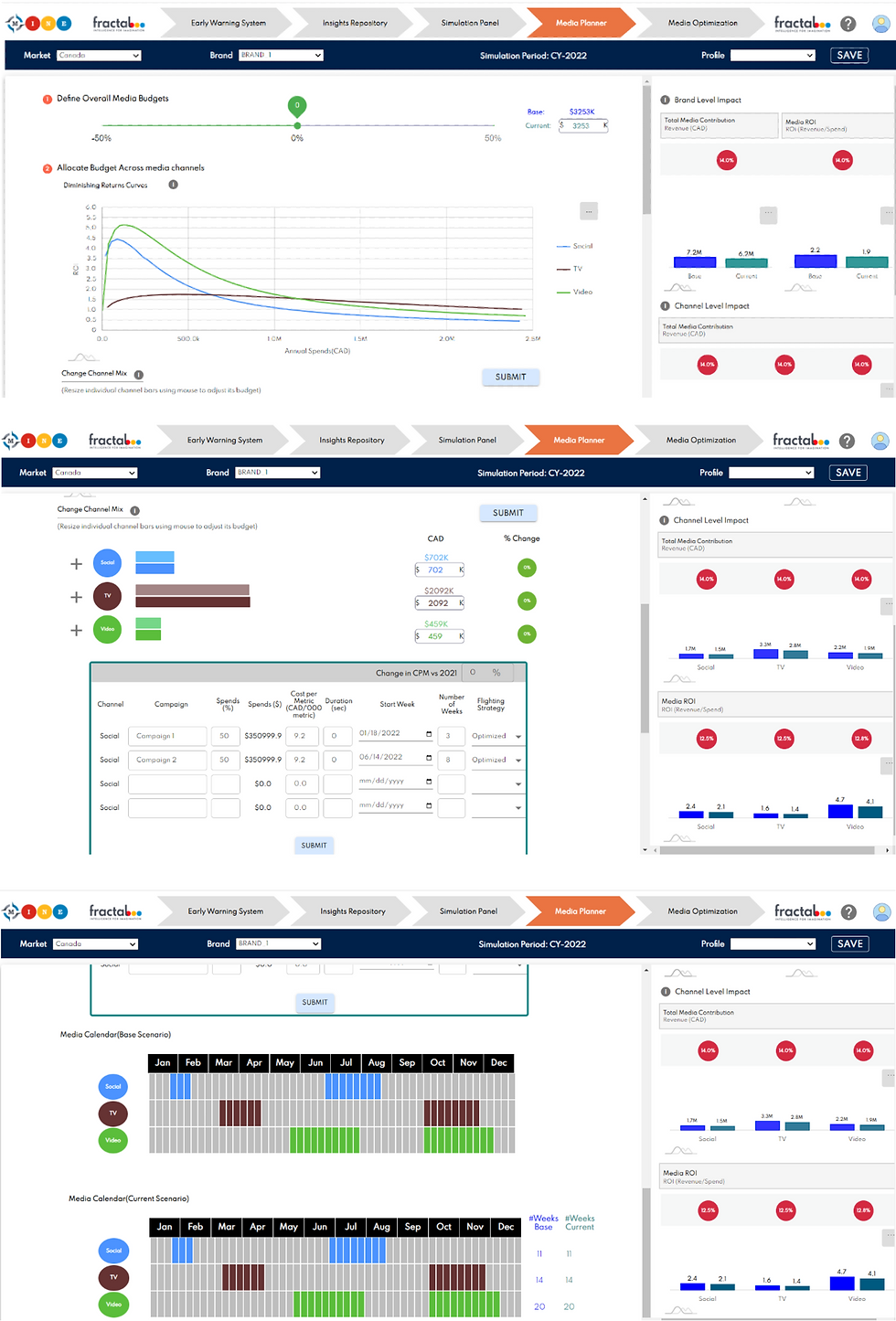
Original Data View
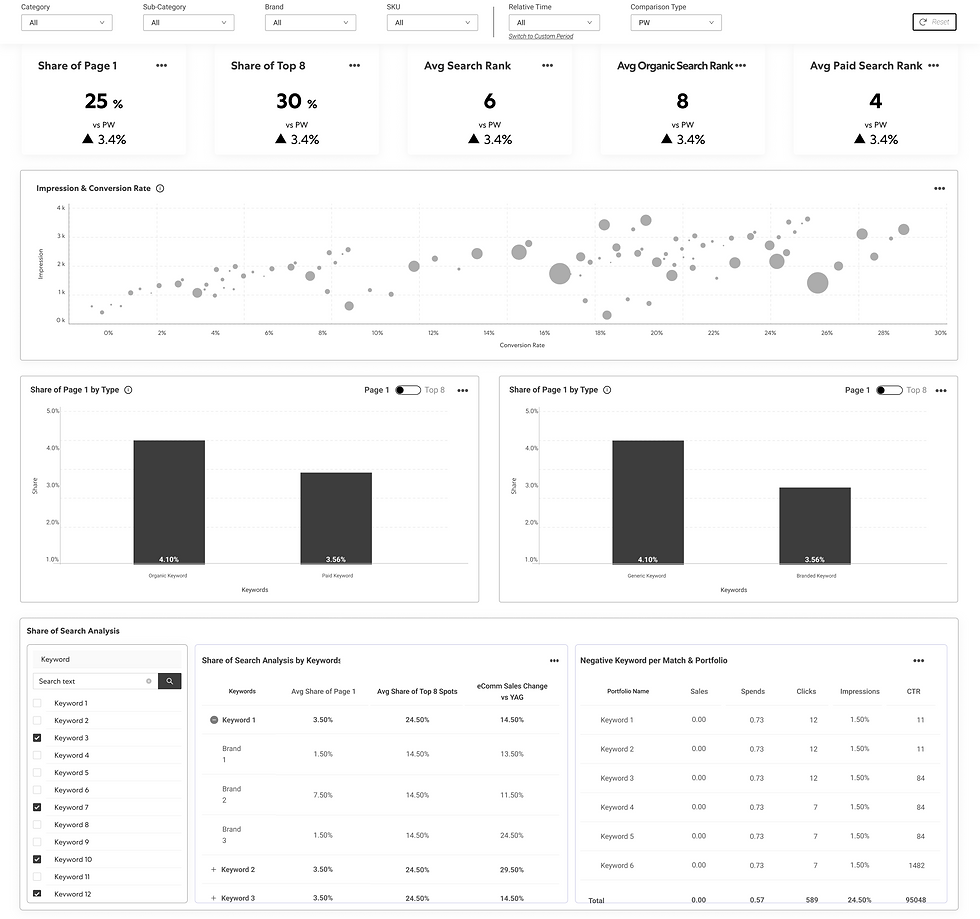
Filter System
Multi-dimensional filtering interface allowing users to segment data by region, time period, category, and custom parameters

High-Fidelity Dashboard Design

Low-Fidelity Wireframe

Original Data View
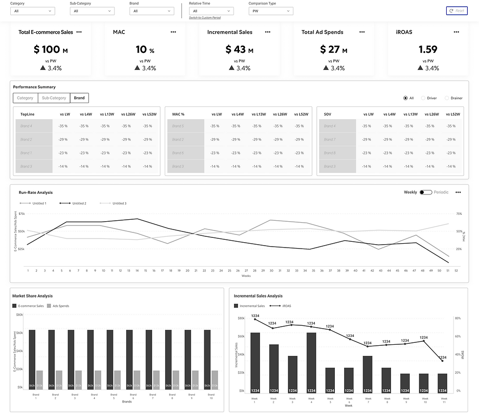
Visual Charts
Auto-generated bar charts, line graphs, and pie charts with interactive tooltips and export options

Low-Fidelity Wireframe

High-Fidelity Dashboard Design
Detailed Reports
Comprehensive report views with data tables, visualizations, and narrative insights for deep analysis
Low-Fidelity Wireframe
High-Fidelity Dashboard Design
Export & Share
Flexible export options including PDF, PNG, and shareable links with permission controls

Low-Fidelity Wireframe

High-Fidelity Dashboard Design
Alert Configuration
Customizable alert system allowing users to set thresholds and receive notifications via email or in-app

Low-Fidelity Wireframe

High-Fidelity Dashboard Design
Automation
Configure scheduled reports, automated email workflows, and data refresh triggers to streamline recurring analytics tasks

Low-Fidelity Wireframe

High-Fidelity Dashboard Design
Data Integration
Seamless connectivity to multiple data sources including databases, APIs, cloud storage, and third-party platforms
Low-Fidelity Wireframe

High-Fidelity Dashboard Design
Correlation Matrix View
Shows KPI relationships in a visual grid (e.g., cost vs. lead time). Interactive nodes reveal dependencies and optimization opportunities.

Low-Fidelity Wireframe

High-Fidelity Dashboard Design
Trend Analytics View
Shows time-series visuals for cost, delivery, and performance. Helps identify seasonal patterns, anomalies, and long-term trends.

Low-Fidelity Wireframe

High-Fidelity Dashboard Design
Settings & Preferences
User customization panel for dashboard layout, data refresh intervals, and notification preferences

Low-Fidelity Wireframe

High-Fidelity Dashboard Design
Comparative Insights Panel
Displays side-by-side category comparisons. Uses bar and radar charts to highlight performance gaps and efficiency differences.

Low-Fidelity Wireframe

High-Fidelity Dashboard Design
Multi-Layer Drill Chart
Merges hierarchical and donut charts for multi-level exploration. Lets users drill from global to supplier detail seamlessly.

Low-Fidelity Wireframe

High-Fidelity Dashboard Design
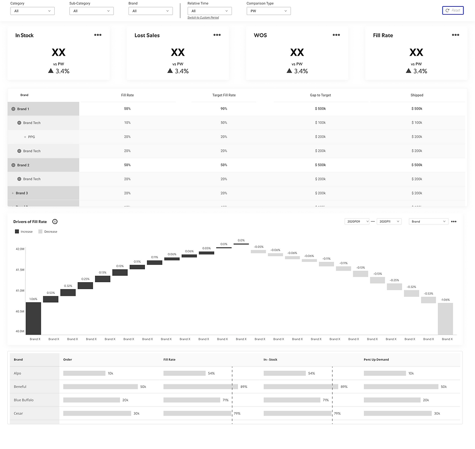
Waterfall Analysis View
Breaks down total costs or savings into additive and subtractive steps. Visualizes how pricing, logistics, and taxes influence overall spend.
Low-Fidelity Wireframe

High-Fidelity Dashboard Design
Settings & Preferences
User customization panel for dashboard layout, data refresh intervals, and notification preferences

Low-Fidelity Wireframe

High-Fidelity Dashboard Design
Usability Testing Insights
Areas for Improvement
Initial learning curve for complex filtering
Some users wanted more customization options
Mobile experience needed further optimization
What Worked
Users found the visual hierarchy clear and intuitive
Data comprehension improved by 60% compared to Excel
Filter system enabled quick data exploration
Export functionality met stakeholder presentation needs
88%
Task Success Rate
15
Stakeholders Tested
60%
Data Comprehension Improvement
DESIGN SYSTEM
Visual Style Guide
A refined design system balancing corporate precision with visual calm
UI Components
Cards
Card Title
Card content with minimal styling and clear hierarchy.
Tinted Card
Alternative card style with subtle background tint.
Buttons
Icon System
Charts
Filters
Dashboard
Alerts
Icons from Lucide React library · 24px base size · Consistent 2px stroke width · Rounded caps
Typography Hierarchy
H1
The quick brown fox
Mars Centra
·
3rem (48px)
·
Weight 500
·
Page titles
H2
The quick brown fox
Mars Centra
·
2rem (32px)
·
Weight 500
·
Section headings
H3
The quick brown fox
Mars Centra
·
1.5rem (24px)
·
Weight 500
·
Subsection headings
Body Large
The quick brown fox
Mars Centra
·
1.25rem (20px)
·
Weight 400
·
Intro paragraphs
Body
The quick brown fox
Mars Centra
·
1rem (16px)
·
Weight 400
·
General body text
Caption
The quick brown fox
Mars Centra
·
0.875rem (14px)
·
Weight 400
·
Labels & captions
Color Palette
Deep Blue
#0000A0
Primary brand color, CTAs
Soft Indigo
#8080CF
Secondary accents, borders
Mint Aqua
#80EBDC
Interactive highlights
Coral
#FF9D8A
Accent highlights
Graphite
#1E293B
Primary headings & text
Slate
#334155
Secondary headings
Steel
#64748B
Body text & icons
Silver
#94A3B8
Muted text & accents
Cloud
#CBD5E1
Borders & dividers
Mist
#E2E8F0
Backgrounds & cards
CONCLUSION
Thank you for exploring this case study
Interested in seeing more of my work in data visualization and digital transformation? Let's connect and discuss how UX/UI design can unlock the power of your data.
Explore More Case Studies
Key Learnings
Context Over Complexity
Understanding the business context and user workflows is crucial before designing dashboard interfaces. Collaborating with business consultants ensured our designs aligned with actual analytical needs.
Visual Hierarchy Drives Insights
Converting tabular data into infographic-style visualizations dramatically improved comprehension. Clear hierarchy and intentional use of color guided users to critical insights faster than traditional spreadsheets ever could.
Flexibility for Different Stakeholders
Different stakeholders needed different views of the same data. Building flexible filtering and customization options ensured the dashboard served marketing managers, analysts, and executives equally well.
Project Impact
85%
Time Saved on Reporting
9
Dashboard Modules Designed
60%
Data Comprehension Improvement
From Spreadsheets to Strategic Intelligence
The MARS dashboard transformation demonstrates how thoughtful UX/UI design can revolutionize data accessibility and decision-making. By converting static Excel files into dynamic, interactive dashboards, we enabled MARS teams to derive insights instantly rather than spending hours on manual data manipulation.
This project at Fractal Analytics showcased the critical role of collaboration between business consultants and UX designers in digital transformation initiatives—balancing analytical depth with visual clarity to create tools that empower stakeholders at every level.
bottom of page